CASE STUDY
As graphic designer at Burnt Waffle Marketing, I worked with Grand PooBox to relaunch their brand and digital presence ahead of the Grand PooBox 2.0 product launch.
The goal was to create a clean, modern identity and website experience that reflected the product’s core benefit while building early momentum through a waitlist.
GRAND POOBOX

THE CHALLENGE
The brand came in with a very limited foundation, a single logo with no supporting system, and an existing website that did not reflect the direction the client envisioned.
At the same time, the business was preparing to relaunch after a hiatus, which meant the new brand and website needed to feel intentional, cohesive, and ready to support growth from day one.

THE GOAL
-
Relaunch the brand with a cohesive visual identity
-
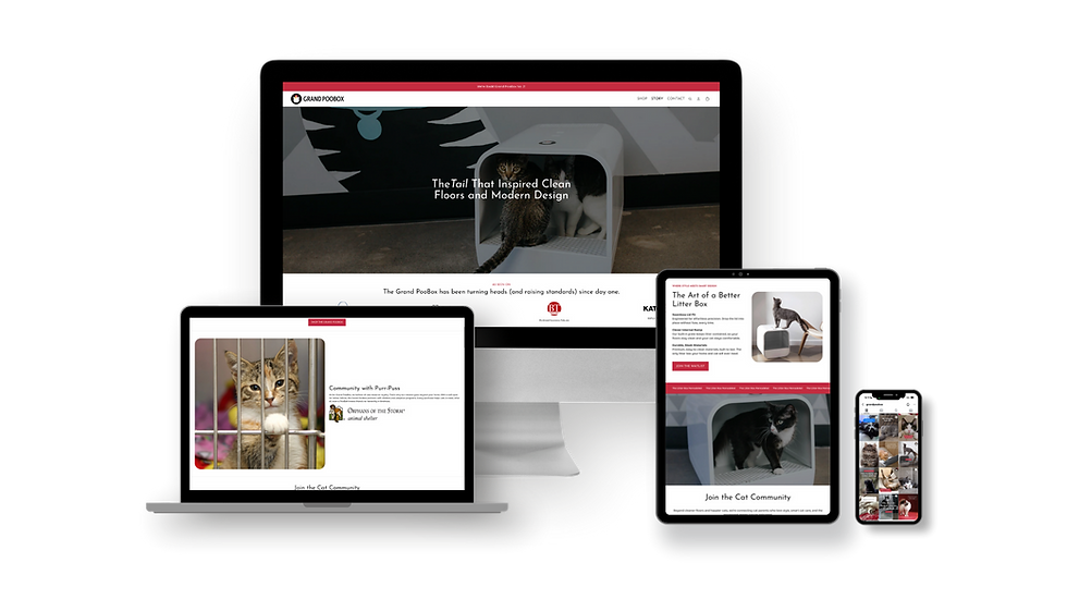
Design and build a custom Shopify website
-
Support the launch of Grand PooBox 2.0
-
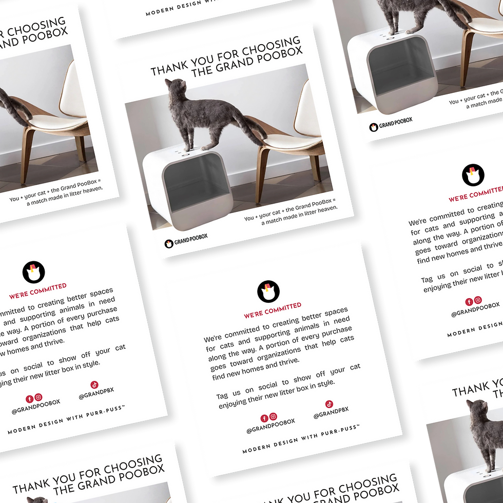
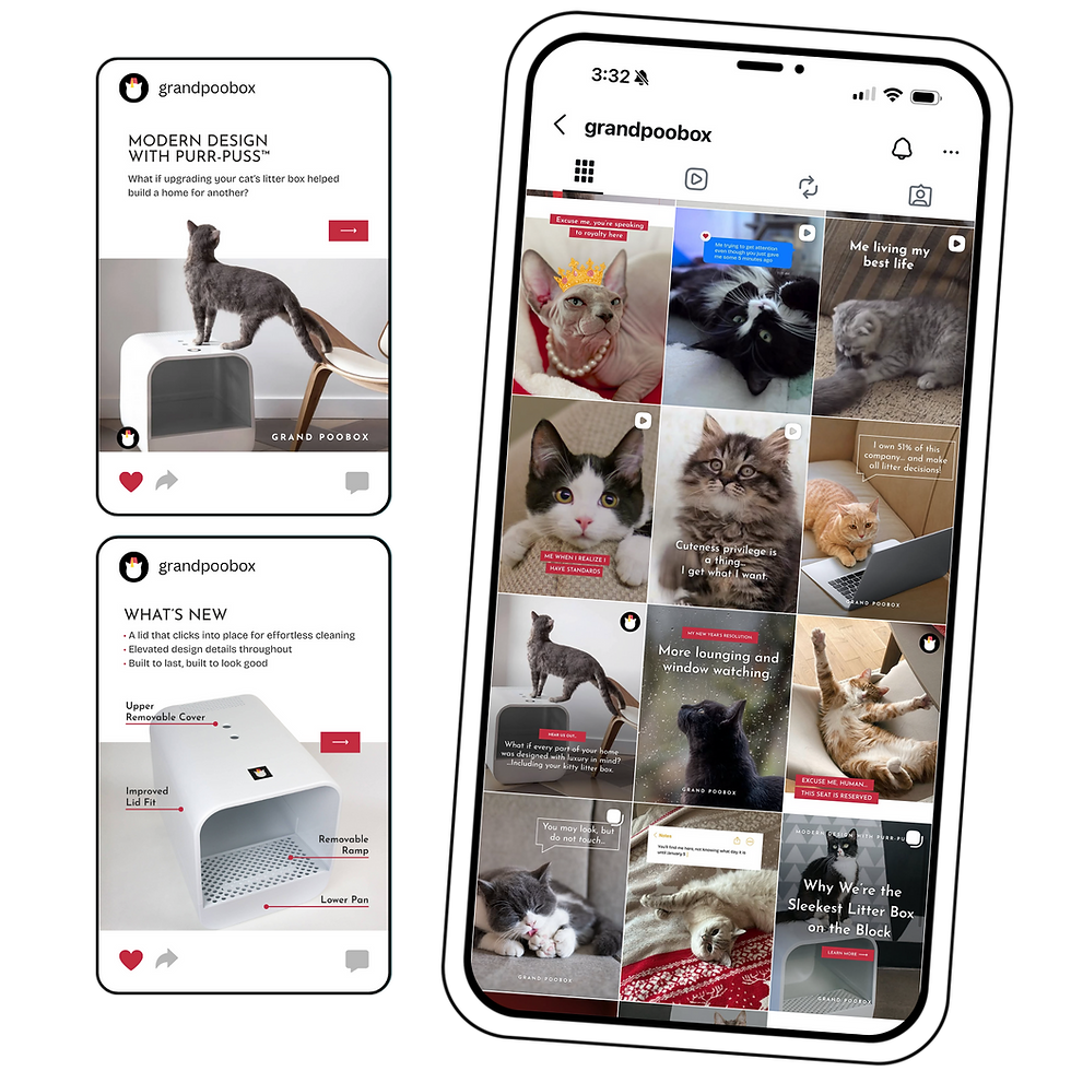
Create a scalable system across web, email, and social


THE APPROACH
The design direction centered around a clean, minimal, and structured aesthetic to reflect the product’s focus on cleanliness and functionality.
The goal was to create something that felt “sterile” in the best way, modern, simple, and highly intentional, while still maintaining warmth and personality.
White space was used strategically to create clarity and breathing room, while subtle details helped bring the brand to life without overcomplicating it.
THE RESULTS
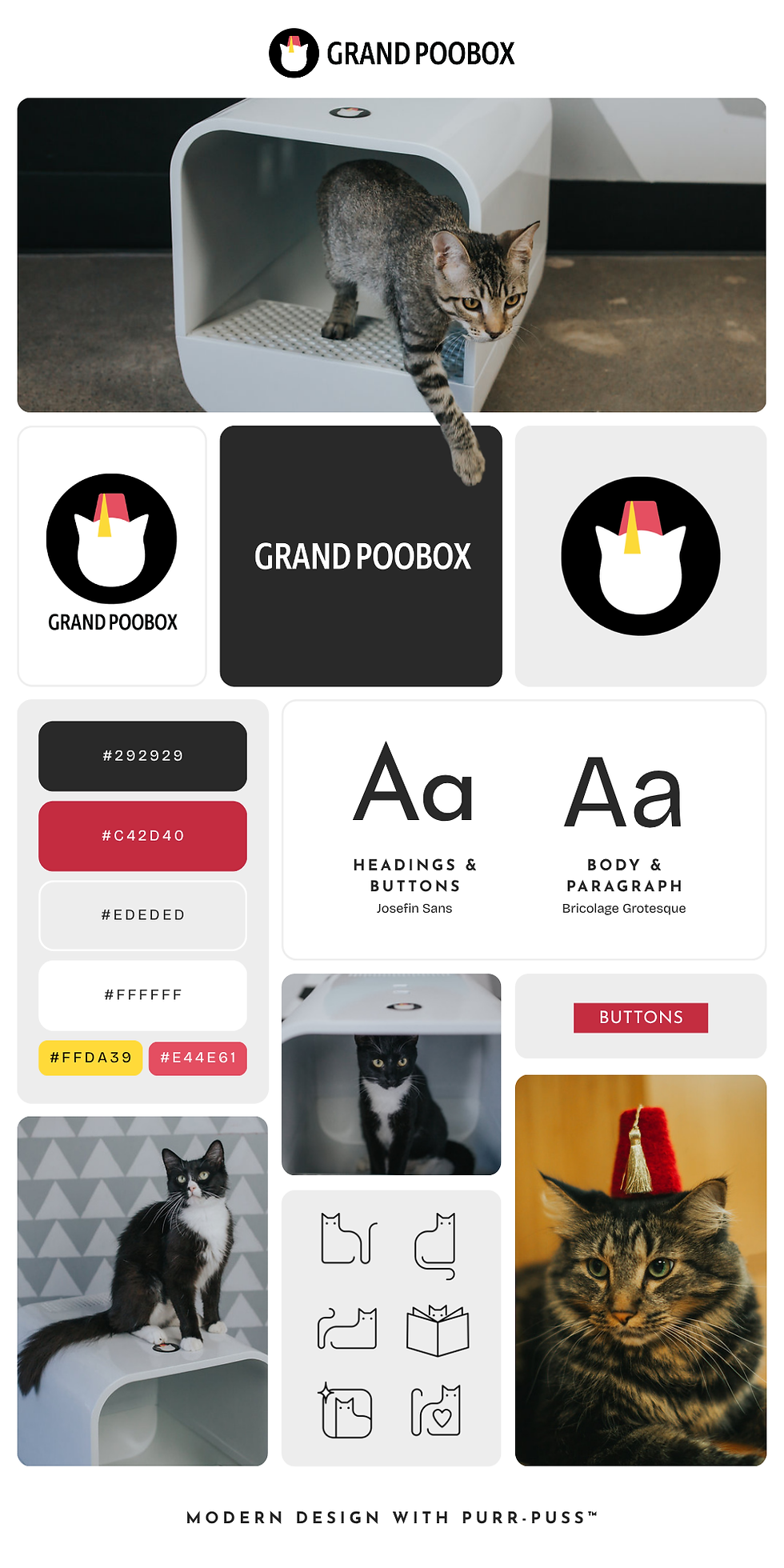
Starting from a single logo, we developed a complete brand system designed to work seamlessly across digital and physical touchpoints.
This included:
-
A full logo suite
-
A refined black, white, and red color palette
-
A clear typography system and hierarchy
-
Custom iconography that is simple, functional, and approachable
To balance the minimal aesthetic, rounded corners were introduced across imagery and design elements, subtly reflecting the shape of the product itself.


_pn.png)
